Rethinking "Add to dashboard"
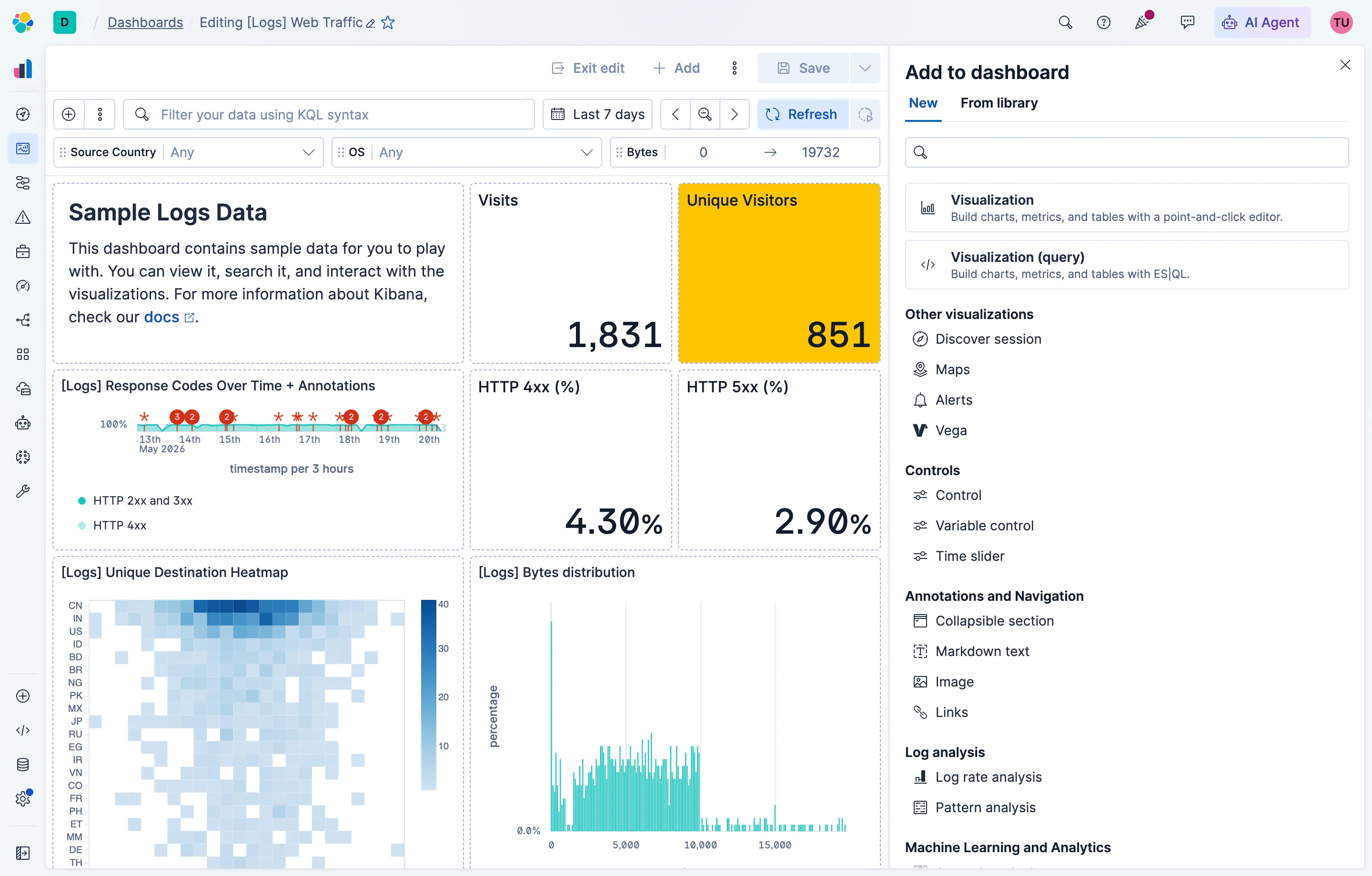
I shipped this across two pull requests — #269407 and #264457 — directly to the Kibana codebase.
Problem
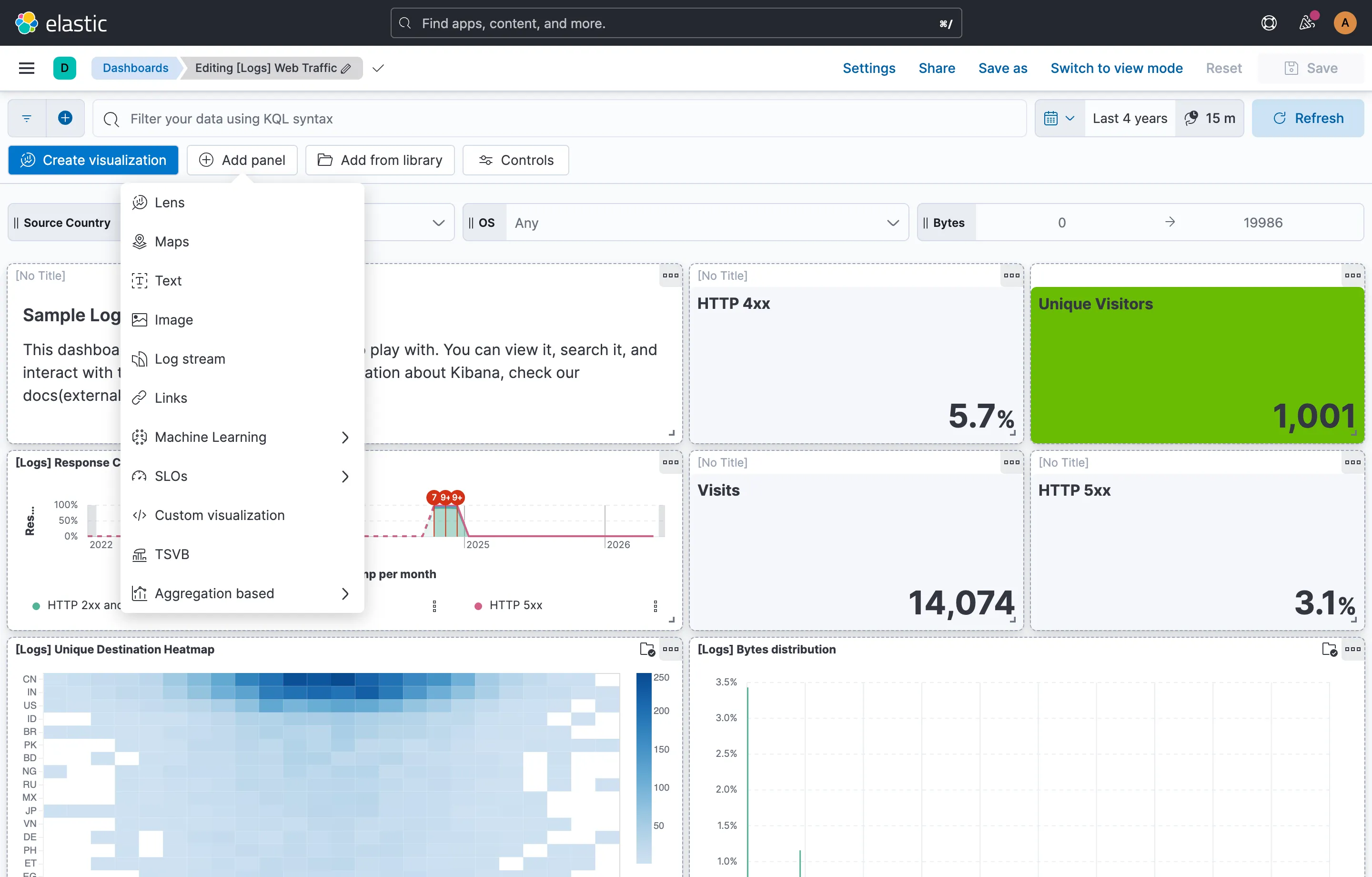
Kibana dashboards have two modes: edit and view. In edit mode, a persistent toolbar sat at the top of the canvas with all the entry points for adding content — “Create visualization”, “Add panel”, “Add from library”, and “Controls”. It worked when there were only a handful of panel types, but it had two problems that kept getting worse.
The first was vertical space. Dashboard authors care a lot about how their dashboard will look in view mode, and the toolbar was taking up real estate that only existed while editing — forcing authors to constantly toggle modes to check their layout. The second was scalability. The “Add panel” entry point opened a popover, and as solutions across Elastic started contributing more and more panel types, a popover stopped being the right container. It couldn’t grow indefinitely, and there was no room for organization, search, or surfacing the panels people use most.
Solution
The toolbar collapsed into a single “Add” button in the dashboard header. Clicking it opens a flyout instead of a popover, which gives the experience room to breathe and to grow as more panel types ship.
Inside the flyout, panels are grouped into categories — visualizations, controls, annotations and navigation, log analysis, machine learning, and more — so authors can scan by intent rather than scroll a flat list. A featured section at the top highlights the most important or most popular panel types, so the common case is one click away. And because the list will only keep growing, the flyout has a search field that filters across every category.
The result is a dashboard canvas that looks the same in edit mode as it does in view mode, and an add-panel experience that scales as Kibana scales.
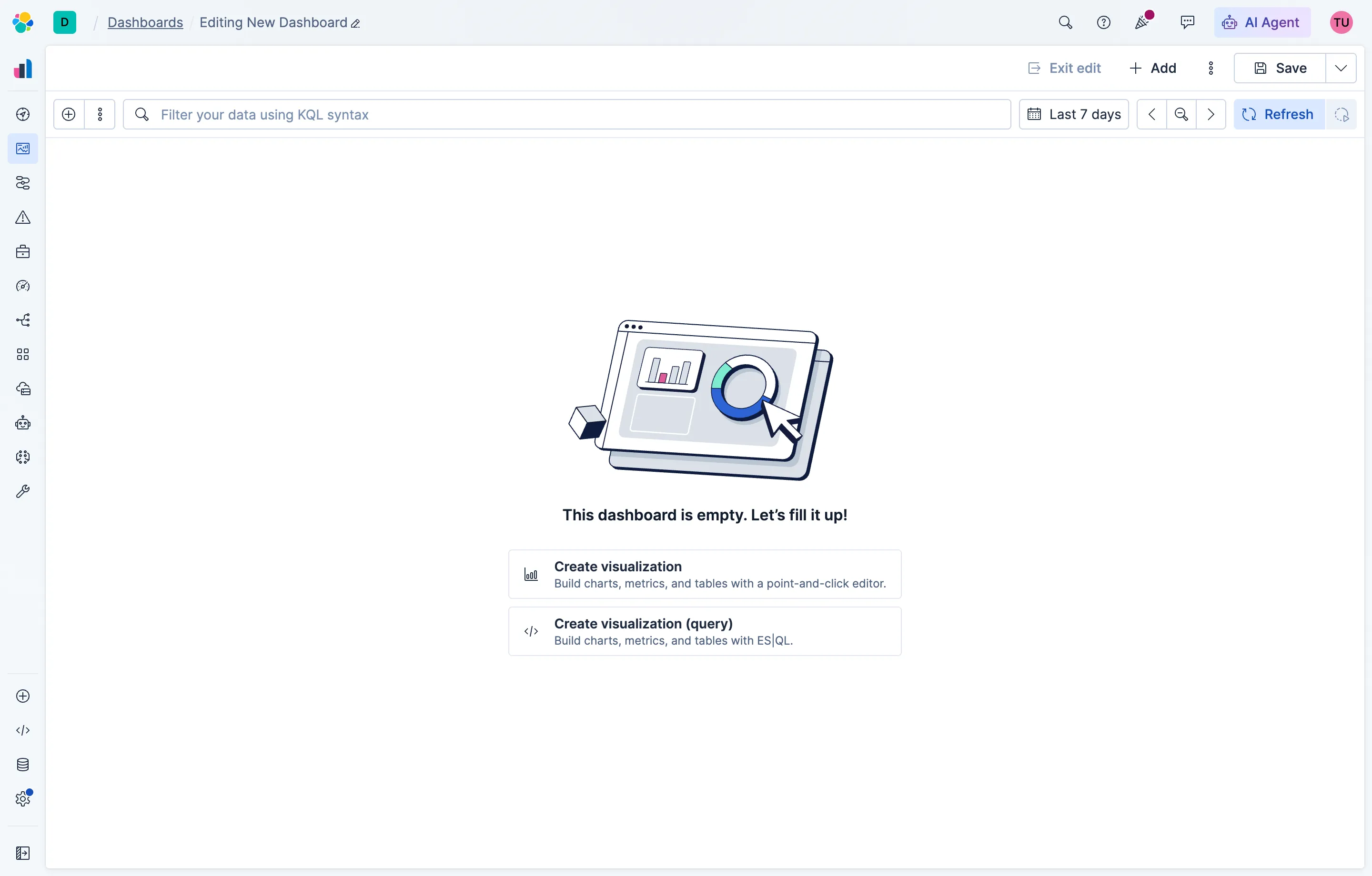
The redesign extended to the empty dashboard state, too. A blank dashboard used to drop authors into a generic placeholder that didn’t share any visual or interaction language with the new flyout. Now the empty state mirrors the same structure — the featured panel types are surfaced inline, so the first action a new dashboard suggests is also the most useful one. The flyout and the empty state read as parts of one system instead of two.
The empty state also had a longer-standing problem: its illustration was from an older era of Kibana’s visual language, before the creative direction shifted. Nobody flagged this as part of the project scope — I recognized it, decided it needed to be fixed, and knew how to get it done. I engaged Elastic’s creative services team as an internal client: I scoped the request, wrote the brief, and gave direction through their iterations until we landed on an illustration that fit both the updated brand and the redesigned surface.
Outcomes
Authors get their full canvas back in edit mode, with no toolbar competing for vertical space. The new flyout gives the design room to absorb new panel types without breaking the existing mental model, and the featured section plus search make the common cases faster while keeping the long tail discoverable. The single entry point also simplifies onboarding: there’s now one obvious place to add anything to a dashboard, instead of four buttons that each did something slightly different.